Tutorial: How to Plot Sensor Data Using Python
This tutorial shows how to plot Project Aria sensor data using Python. This example covers how to:
- Save images as PNGs
- Plot raw sensor data from a VRS file and store the plots in PDF files (data is plotted with Matplotlib)
Use the Aria Sensor Viewer to get the relative position and orientation of most sensors
Getting started
Use the data_provider to open the VRS file you want to work with.
from projectaria_tools.core import data_provider, image
from projectaria_tools.core.stream_id import StreamId

vrsfile = "example.vrs"
provider = data_provider.create_vrs_data_provider(vrsfile)
Save Images as PNGs
Project Aria glasses store images in JPEG or RAW format. Project Aria Tools supports converting image data to numpy arrays. These images can then be converted to PIL images and saved as PNG files.
from PIL import Image
stream_mappings = {
    "camera-slam-left": StreamId("1201-1"),
    "camera-slam-right": StreamId("1201-2"),
    "camera-rgb": StreamId("214-1"),
    "camera-eyetracking": StreamId("211-1"),
}

index = 1 # sample index (as an example)
for [stream_name, stream_id] in stream_mappings.items():
    image = provider.get_image_data_by_index(stream_id, index)
    Image.fromarray(image[0].to_numpy_array()).save(f'{stream_name}.png')
These snippets will save the following images to the local folder:
| SLAM images |   |
| Eye Tracking images | |
| RGB images |  |
Plot raw sensor data
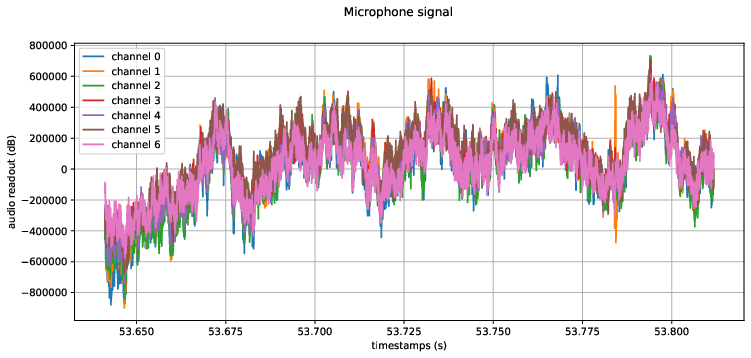
Audio
Audio data can vary, depending on whether 7 or 2 spatial microphones were recording. Most recording profiles use 7 microphones.
- 7 microphones 7x4096 data chunks
- 2 microphones 2x2048 data chunks
- Load the audio data
stream_id = provider.get_stream_id_from_label("mic")
timestamps = []
audio = [[] for c in range(0, 7)]
for index in range(0, 2):
  audio_data_i = provider.get_audio_data_by_index(stream_id, index)
  audio_signal_block = audio_data_i[0].data
  timestamps_block = [t * 1e-9 for t in audio_data_i[1].capture_timestamps_ns];
  timestamps += timestamps_block
  for c in range(0, 7):
    audio[c] += audio_signal_block[c::7]
- Plot the data with
matplotlib
plt.figure()
fig, axes = plt.subplots(1, 1, figsize=(12, 5))
fig.suptitle(f"Microphone signal")
for c in range(0, 7):
  plt.plot(timestamps, audio[c], '-', label = f"channel {c}")
axes.legend(loc='upper left')
axes.grid('on')
axes.set_xlabel('timestamps (s)')
axes.set_ylabel('audio readout')
plt.savefig("audio.pdf", format="pdf", bbox_inches="tight")
IMU
We recommend using Trajectory MPS outputs instead of raw IMU data wherever possible. There may be instances, however, when you need to work directly with the IMU data.
Project Aria glasses have two IMUs. They operate at different rates, so that any errors do not align.
- IMU (1kHz) -
imu-right - IMU (800Hz) -
imu-left
- Organize the data into 6 lists. Each list stores one axis of a specific IMU.
stream_id = provider.get_stream_id_from_label("imu-left")
accel_x = []
accel_y = []
accel_z = []
gyro_x = []
gyro_y = []
gyro_z = []
timestamps = []
for index in range(0, provider.get_num_data(stream_id)):
  imu_data = provider.get_imu_data_by_index(stream_id, index)
  accel_x.append(imu_data.accel_msec2[0])
  accel_y.append(imu_data.accel_msec2[1])
  accel_z.append(imu_data.accel_msec2[2])
  gyro_x.append(imu_data.gyro_radsec[0])
  gyro_y.append(imu_data.gyro_radsec[1])
  gyro_z.append(imu_data.gyro_radsec[2])
  timestamps.append(imu_data.capture_timestamp_ns * 1e-9)
- Plot the data with
matplotlib
plt.figure()
fig, axes = plt.subplots(1, 2, figsize=(12, 5))
fig.suptitle(f"{stream_id.get_name()}")

axes[0].plot(timestamps, accel_x, 'r-', label="x")
axes[0].plot(timestamps, accel_y, 'g-', label="y")
axes[0].plot(timestamps, accel_z, 'b-', label="z")
axes[0].legend(loc='upper left')
axes[0].grid('on')
axes[0].set_xlabel('timestamps (s)')
axes[0].set_ylabel('accelerometer readout (m/sec2)')

axes[1].plot(timestamps, gyro_x, 'r-', label="x")
axes[1].plot(timestamps, gyro_y, 'g-', label="y")
axes[1].plot(timestamps, gyro_z, 'b-', label="z")
axes[1].legend(loc='upper left')
axes[1].grid('on')
axes[1].set_xlabel('timestamps (s)')
axes[1].set_ylabel('gyroscope readout (rad/sec)')
The plotted image looks like this:
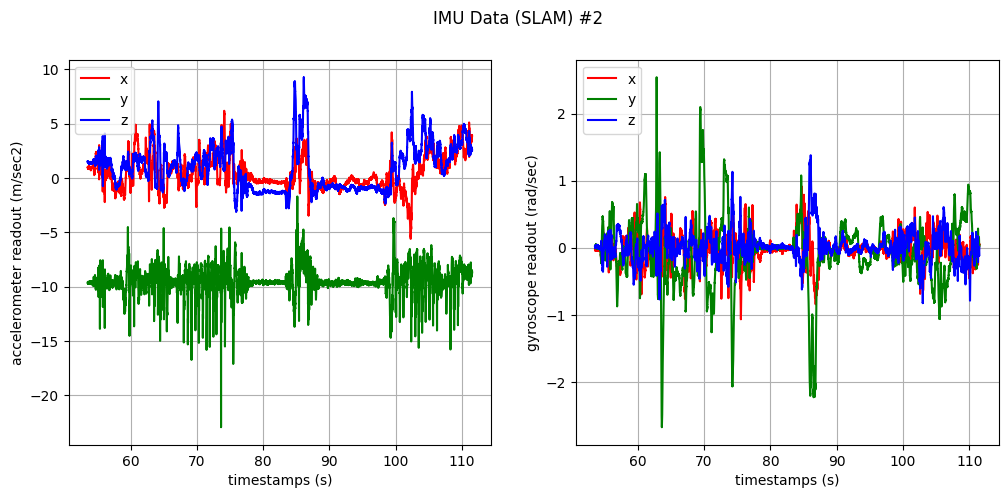
- Save the plot to PDF
plt.savefig("imu.pdf", format="pdf", bbox_inches="tight")
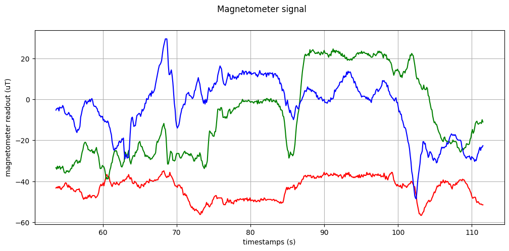
Magnetometer
Plotting magnetometer is similar to plotting IMU.
- Organize the data into 3 lists. Each list stores one axis of magnetometer data.
stream_id = provider.get_stream_id_from_label("mag0")
mag_x = []
mag_y = []
mag_z = []
timestamps = []
for index in range(0, provider.get_num_data(stream_id)):
  mag_data = provider.get_magnetometer_data_by_index(stream_id, index)
  mag_x.append(mag_data.mag_tesla[0] * 1e6)
  mag_y.append(mag_data.mag_tesla[1] * 1e6)
  mag_z.append(mag_data.mag_tesla[2] * 1e6)
  timestamps.append(mag_data.capture_timestamp_ns * 1e-9)
- Plot the data with
matplotlib
plt.figure()
fig, axes = plt.subplots(1, 1, figsize=(12, 5))
fig.suptitle(f"Magnetometer signal")

axes.plot(timestamps, mag_x, 'r-', label="x")
axes.plot(timestamps, mag_y, 'g-', label="y")
axes.plot(timestamps, mag_z, 'b-', label="z")
axes.legend(loc='upper left')
axes.grid('on')
axes.set_xlabel('timestamps (s)')
axes.set_ylabel('magnetometer readout (uT)')
plt.savefig("mag.pdf", format="pdf", bbox_inches="tight")
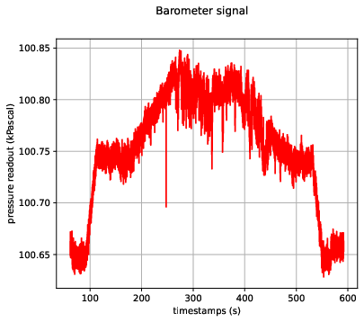
Barometer
- Load and plot the data using the following commands
plt.figure()
fig, axes = plt.subplots(1, 2, figsize=(12, 5))
fig.suptitle(f"Barometer signal")

stream_id = provider.get_stream_id_from_label("baro0")
pressure = []
temperature = []
timestamps = []
for index in range(0, provider.get_num_data(stream_id)):
  baro_data = provider.get_barometer_data_by_index(stream_id, index)
  pressure.append(baro_data.pressure * 1e-3)
  temperature.append(baro_data.temperature)
  timestamps.append(baro_data.capture_timestamp_ns * 1e-9)

axes[0].plot(timestamps, pressure, 'r-')
axes[0].grid('on')
axes[0].set_xlabel('timestamps (s)')
axes[0].set_ylabel('pressure readout (kPascal)')

axes[1].plot(timestamps, temperature, 'r-')
axes[1].grid('on')
axes[1].set_xlabel('timestamps (s)')
axes[1].set_ylabel('temperature readout (C)')

plt.savefig("baro.pdf", format="pdf", bbox_inches="tight")

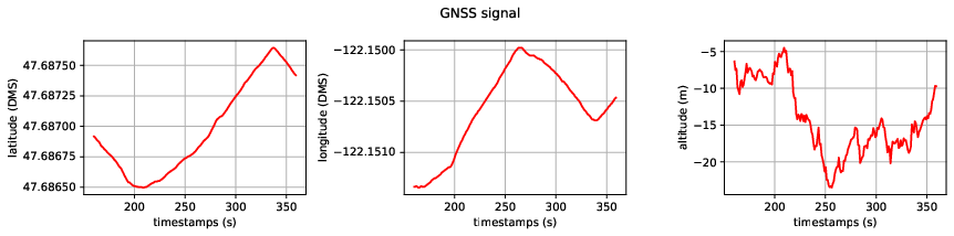
GPS
GPS data can be visualized with 2D or 3D plots.
2D plots
plt.figure()
fig, axes = plt.subplots(1, 3, figsize=(12, 3))
fig.suptitle(f"GPS signal")

stream_id = provider.get_stream_id_from_label("gnss")
latitude = []
longitude = []
altitude = []
timestamps = []
for index in range(100, 300):
  gps_data = provider.get_gps_data_by_index(stream_id, index)
  latitude.append(gps_data.latitude)
  longitude.append(gps_data.longitude)
  altitude.append(gps_data.altitude)
  timestamps.append(gps_data.capture_timestamp_ns * 1e-9)

ax = axes[0]
ax.plot(timestamps, latitude, 'r-')
ax.grid('on')
ax.set_xlabel('timestamps (s)')
ax.set_ylabel('latitude')
ax.yaxis.set_major_formatter(ticker.ScalarFormatter(useMathText=True, useOffset=False))

ax = axes[1]
ax.plot(timestamps, longitude, 'r-')
ax.grid('on')
ax.set_xlabel('timestamps (s)')
ax.set_ylabel('longitude')
ax.yaxis.set_major_formatter(ticker.ScalarFormatter(useMathText=True, useOffset=False))

ax = axes[2]
ax.plot(timestamps, altitude, 'r-')
ax.grid('on')
ax.set_xlabel('timestamps (s)')
ax.set_ylabel('altitude')
ax.yaxis.set_major_formatter(ticker.ScalarFormatter(useMathText=True, useOffset=False))

fig.tight_layout()
plt.savefig("gps.pdf", format="pdf", bbox_inches="tight")
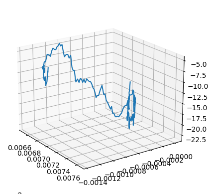
3D plots
plt.figure()
fig = plt.figure()

axes = fig.add_subplot(projection='3d')
axes.plot(latitude, longitude, altitude)
axes.view_init(elev=20., azim=-35, roll=0)
plt.savefig("gps3d.pdf", format="pdf", bbox_inches="tight")
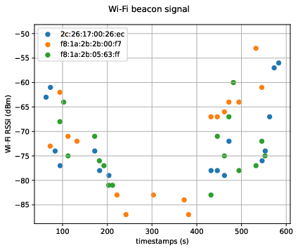
Wi-Fi beacon
- Group the Wi-Fi beacon data by mac bssid
stream_id = provider.get_stream_id_from_label("wps")
rssi = {}
timestamps = {}
print(provider.get_num_data(stream_id))
for index in range(0, provider.get_num_data(stream_id)):
  wps_data = provider.get_wps_data_by_index(stream_id, index)
  if wps_data.bssid_mac not in rssi:
    rssi[wps_data.bssid_mac] = []
    timestamps[wps_data.bssid_mac] = []
  rssi[wps_data.bssid_mac].append(wps_data.rssi)
  timestamps[wps_data.bssid_mac].append(wps_data.board_timestamp_ns * 1e-9)
- Plot the mac address
- This example has > 15 samples
plt.figure()
fig, ax = plt.subplots(1, 1, figsize=(6, 5))
fig.suptitle(f"Wi-Fi beacon signal")

for ssid in list(timestamps.keys()):
  if len(timestamps[ssid]) < 15:
    continue
  ax.scatter(timestamps[ssid], rssi[ssid], label=ssid)

ax.grid('on')
ax.set_xlabel('timestamps (s)')
ax.set_ylabel('Wi-Fi RSSI(dBm)')
plt.legend(loc='upper left')
plt.savefig("wifi.pdf", format="pdf", bbox_inches="tight")
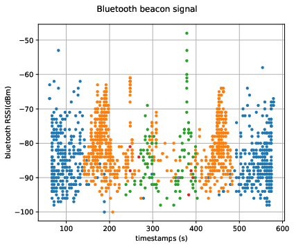
Bluetooth beacon
- Group data by
unique_id(similar to Wi-Fi grouping)
stream_id = provider.get_stream_id_from_label("bluetooth")
rssi = {}
timestamps = {}

for index in range(0, provider.get_num_data(stream_id)):
  bluetooth_data = provider.get_bluetooth_data_by_index(stream_id, index)
  if bluetooth_data.unique_id not in rssi:
    rssi[bluetooth_data.unique_id] = []
    timestamps[bluetooth_data.unique_id] = []
  rssi[bluetooth_data.unique_id].append(bluetooth_data.rssi)
  timestamps[bluetooth_data.unique_id].append(bluetooth_data.board_timestamp_ns * 1e-9)
- Plot the data per
unique_id
plt.figure()
fig, ax = plt.subplots(1, 1, figsize=(6, 5))
fig.suptitle(f"Bluetooth beacon signal")

for ssid in list(timestamps.keys()):
  ax.plot(timestamps[ssid], rssi[ssid], '.')
ax.grid('on')
ax.set_xlabel('timestamps (s)')
ax.set_ylabel('bluetooth RSSI(dBm')
fig.tight_layout()

plt.savefig("ble.pdf", format="pdf", bbox_inches="tight")