More about hiplot.Experiment
Drawing lines by connecting Datapoints
HiPlot has an XY graph. By default, it will simply display one dot per datapoint.
However, it is possible to make it draw lines or even trees by specifying offspring relationships.
In an hiplot.Experiment, each point corresponds to a hiplot.Datapoint, and each hiplot.Datapoint has a unique uid.
When a hiplot.Datapoint has his from_uid set to a parent’s uid, the XY graph will connect the parent and the child.
Multiple points can share the same parent - this is especially useful when representing evolving populations.
    exp = hip.Experiment()
    exp.display_data(hip.Displays.XY).update({
        'axis_x': 'generation',
        'axis_y': 'loss',
    })
    for i in range(200):
        dp = hip.Datapoint(
            uid=str(i),
            values={
                'generation': i,
                'param': 10 ** random.uniform(-1, 1),
                'loss': random.uniform(-5, 5),
            })
        if i > 10:
            from_parent = random.choice(exp.datapoints[-10:])
            dp.from_uid = from_parent.uid  # <-- Connect the parent to the child
            dp.values['loss'] += from_parent.values['loss']  # type: ignore
            dp.values['param'] *= from_parent.values['param']  # type: ignore
        exp.datapoints.append(dp)
Frontend rendering settings
It is possible to customize how the data is rendered:
Either globally by attributing a
hiplot.ValueTypeto columns
    exp = hip.fetchers.load_demo("demo")  # Let's create a dummy experiment

    # Change column type
    exp.parameters_definition["optionA"].type = hip.ValueType.NUMERIC_LOG
    # Force a column minimum/maximum values
    exp.parameters_definition["pct_success"].force_range(0, 100)
    # Change d3 colormap (https://github.com/d3/d3-scale-chromatic) for non-categorical columns
    exp.parameters_definition["exp_metric"].colormap = "interpolateSinebow"
Or for invididual components with
hiplot.Experiment.display_data()(see Displays reference for all possible values)
    # Provide configuration for the parallel plot
    exp.display_data(hip.Displays.PARALLEL_PLOT).update({
        # Hide some columns in the parallel plot
        'hide': ['optionB'],
        # Specify the order for others
        'order': ['time'],  # Put column time first on the left
    })

    # Provide configuration for the table with all the rows
    exp.display_data(hip.Displays.TABLE).update({
        # Don't display `uid` and `from_uid` columns to the user
        'hide': ['uid', 'from_uid'],
        # In the table, order rows by default
        'order_by': [['pct_success', 'desc']],
        # Specify the order for columns
        'order': ['time'],  # Put column time first on the left
    })

    # Provide configuration for the XY graph
    exp.display_data(hip.Displays.XY).update({
        # Default X axis for the XY plot
        'axis_x': 'time',
        # Default Y axis
        'axis_y': 'lr',
        # Configure lines
        'lines_thickness': 1.0,
        'lines_opacity': 0.1,
        # Configure dots
        'dots_thickness': 2.0,
        'dots_opacity': 0.3,
    })
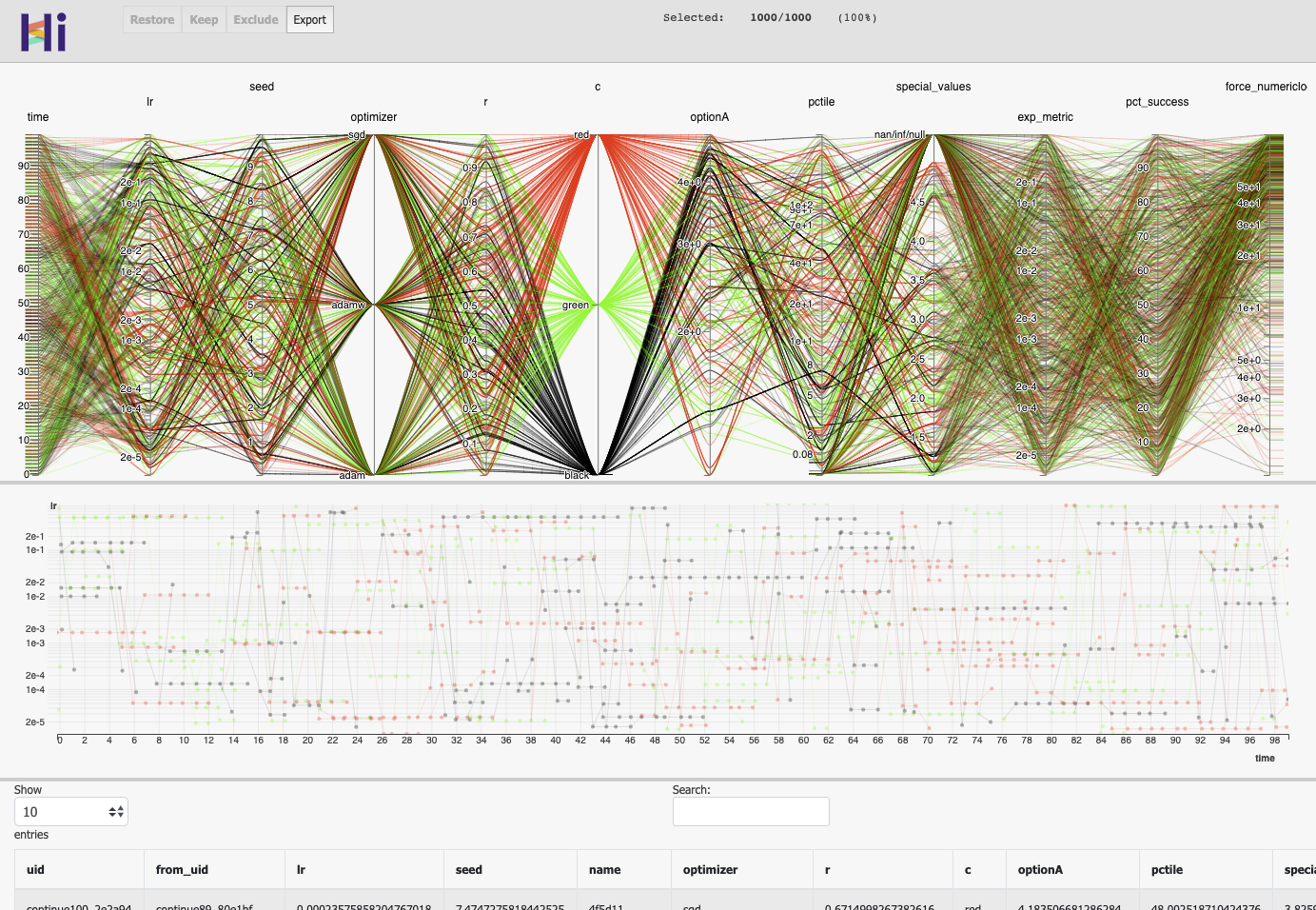
Rendering of the experiment.